How does one make visual sense out of the size of the nuclear stockpile?
On paper it’s just a number. Or a lot of numbers, if you’re talking about it historically. Or even more numbers, if you’re concerned with things like delivery platforms, megatonnage, or megadeaths, what have you.
It’s easy to make visual sense of one or two bombs. A few hundred is still within the realm of sensible representation. But thousands?
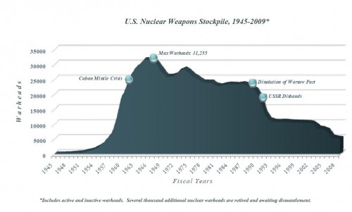
The standard method for awhile has been to use a graph showing stockpile sizes over time. In 2010, the Department of Defense declassified the size of the stockpile (present and historical) and included a rather ugly graph show its change over time:
I don’t want to pick on the DOD, but whoever made this graph could use a little more Edward Tufte in their lives. Beautiful evidence it ain’t. Why is it in pseudo-3D? Come on, guys, this is “How to Make a Chart 101”: don’t use 3D unless there’s a really compelling reason to.
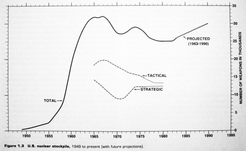
This is itself a variation on a graphic tendency that, as far as I can tell, only began as recently as the early 1980s. NGOs like the Natural Resources Defense Council (NRDC) began making systematic stockpile estimates around this time. Their original 1984 Nuclear Weapons Databook featured what I believe is one of the first attempts to give something of a comprehensive graph of past US nuclear warheads: 1
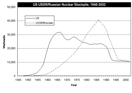
Here’s a more updated version of the NDRC historical stockpiles graph, something you’ve probably seen variants of before:
This is a sensible way to show historical trends, of course. But as a graphic representation of complicated information, it can be misleading as well.
For example, these graphs just show warheads. Warheads, by themselves, do not really represent the full nuclear threat. Yes, they’re a big part of it! But one wouldn’t realize from such a graph that by the early 1960s, even though the USSR had thousands of warheads, it didn’t have really great ways to get them to the United States.
And not all warheads are the same — the huge apparent advantage of the USSR/Russia in terms of nuclear arms in the late Cold War is mostly tactical nuclear weapons. (So is the huge ramp-up in the US arsenal before it levels off.) Some warheads are “small” — under a kiloton — and some are massive, region-destroying monsters. In a graph like this, though, they’re all just numbers. Even if you do add in separate lines for them (as in the original NDRC graph, and in many of their nation-specific graphs), it still doesn’t quite convey what kind of nuclear world we’re talking about.
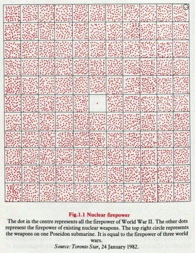
There have been alternative visualizations. One which features prominently in another 1980s product, William Bunge’s wildly unusual Nuclear War Atlas (worthy of its own posting at a later point), is what we might call a “dot graph” showing relative total megatonnage: 2
This would be a little more useful to the expert if we were given some kind of numerical equivalent (I think the dots are about 2Mt each, and I’m not sure if this is meant to be the world arsenal or the US arsenal), but, in any case, it’s a striking attempt to make visible the power of said weapons. It is, of course, not historical — it represents a specific moment in the history of the nuclear arsenal.
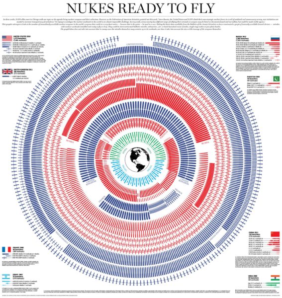
I bring all this up as a prelude to talking about another visualization which has been floating around the Internet this week, a visualization of the world nuclear arsenals by Andrew Barr and Richard Johnston of the National Post:
The dataset this is based on is from the Federation of American Scientists, who seems to have inherited the NDRC’s old mission (and dataset) of making these kinds of estimates.
It’s a cool graphic, and not a representation style I’ve seen before. What they’re showing, here, are strategic launchers — not warheads — represented by little pictures of the weapons in question. This does two things that I like very much: it gets away from focusing just on warheads, and it also makes them feel more “tangible.”
Warheads are important. They shouldn’t be ignored. But if the worst were to happen, it’s the launchers that are going to be what causes all the damage. The warheads stashed in a cave somewhere are politically important, and important from a safeguards and security perspective, but they’re not part of the immediate calculus of nuclear war.
I like representing these as discrete entities, as opposed to just a line on a graph, or just a number. 1,379 launchers — the US estimate — doesn’t sound that big in any of itself. And if you look at it historically, like the NDRC warhead graphs, it’s hard not to see that as a huge improvement over the situation in the Cold War! But when you draw each of them out individually, and know that each of them has essentially a city-destroying, megadeath-creating consequence, it suddenly looks like quite a lot indeed.
I also like that even the “small” arsenals of the UK, France, China, India, Pakistan, and Israel, look pretty large enough when you draw them out this way.
And putting the poor little Earth at the center was a stroke of graphic genius. If the missiles were lined up in a row, pointing at the sky, it might be possible to see them as a sign of safety or security. But they’re pointed at a tiny, vulnerable planet. They’re pointed at all of us.
(Which is not actually an exaggeration. Even regional nuclear wars would be global in consequences. Anyone who thinks that it would be fine to let India and Pakistan blow themselves to hell should read this article. As with all expert estimates and simulations, there are those who will quibble with it one way or another, but it seems like reason enough to think that we’re all in the same boat on this.)
There are, of course, issues to be taken with it. One that the authors acknowledge is MIRVs — putting more than one warhead on each missile. My understanding is that under the various arms control treaties, we don’t actually do a whole lot of that these days (certainly not the maximum “12 warheads per missile” for some of them), but it’s still worth noting that some of these missiles actually contain two or three nuclear weapons each — which multiplies the total destruction significantly. The authors do note this.
Another is that these are only strategic weapons — that is, the big bombs meant to be used only in the event of total nuclear war, destroying whole cities, etc. Lacking are tactical weapons — the little bombs that states might actually be tempted to use in local conflicts, blowing up bunkers, etc. The problem is that it’s hard to get a handle on tactical weapons, as David Hoffman recently wrote, and ignoring them has consequences.
Furthermore, there is a lot of fuzziness in estimating actual launcher types. From this graph alone, you’d think that the USA was the only country that still used atomic bombs dropped from airplanes, and that everyone else used exclusively missiles. But that’s probably not the case — all estimates about the Indian, Pakistani, and Israeli programs are very fuzzy, and it’s likely that some of the Russian tactical nuclear arsenal is delivered through gravity bombs as well.
Anyway, I’ll concede that some of these are nit-picky, wonky points. On the whole, I think this new visualization is a great success: it actually conveys some realistic, wonky technical information in a way that your average Internet user can make sense of and recognize as being relevant to the world they live in, without wildly distorting the facts very much. That’s not an easy thing to do!
- Thomas B. Cochran, William M. Arkin, and Milton M. Hoenig, Nuclear Weapons Databook: Volume I: U.S. Nuclear Forces and Capabilities (Cambridge, Mass.: Ballinger Publishing, 1984), on 14.[↩]
- William Bunge, Nuclear War Atlas (New York, N.Y.: Blackwell, 1988), on 12.[↩]


While perhaps unintentional, there is a visual bias in the National Post depiction.
The delivery systems for the USA are drawn larger than that of the Russia. Visually, that makes the US arsenal look substantially bigger than Russia’s.
A better method would be to size the weapon to its aggregate strength of number of warheads and its maximum deployment yeild.
A single SS-19 Stiletto carries 30MTon equivelent. Yet, it is ‘smaller’ than a Mk-21 Minuteman III missile with just a single 300KTon warhead. Literally, two orders of magnitudes of difference.
Of course, one also has differences in accuracy, etc. But it seems to me, using size to indicate the strength/number of the delivered warheads would be an improvement in conveyeing the visualization of the respective systems.
Well, there are a lot of visual biases, due to the use of differently sized warheads. The US arsenal looks considerably larger than the Russian one in this depiction because the latter is on an inner ring and is much more tightly packed. When you look at the numbers, though, they are pretty similar, and just because cruise missiles are physically small doesn’t mean they are low in yield. (And as you note, yield is relegated to the footnotes exclusively in this visualization.)
Still, it is a way of visualizing it that I hadn’t seen before, and those aren’t the easiest things to come up with. Like all visualizations, there is a tradeoff between what you get and what you miss.
Heres another version of the “dot graph,” pretty close to how I first encountered it around 1982-83, and with the explanatory notes lacking in the version you included above – http://c-g-i.info/images/nuclear-weapons-chart.jpg.
Thanks! That one at least specifies that the dots are meant to be 3Mt (I had guessed 2Mt).
This has reminded me of one of the more amusing entries in the RDD-7 list of declassification decisions:
It’s nice to imagine that worming its way through the declassification bureaucracy.
If 100 nukes would cause an extinction event like global winter (?), then what is the psychological phenomenon that prevents sane, good persons from seeking out and ending every sociopath in any way responsible directly or by association with the production of these devices?
Does the great majority not understand the difference between legality and ethics?
May I reference the current terrifying events continually occurring at Fukushima — how correct a culture where no one of the millions who will now die (not just in Japan) because of the greed of one or a few corrupting persons, ever thinks of visiting ethical justice upon him/them?
In our Constitutional society where each citizen is responsible for government when our elected and hired employees fail, is ignorance an excuse?
Are these questions lacking in an academic approach?
Coal mining is far more deadly. In the last century, over 100,000 people have died in the United States alone. While it has improved in the US, it still is deadly. One single accident last year in Kentucky killed 29 miners.
World wide, typical annual numbers are around 10,000 total killed. Around 6,000 from China.
Each year.
And, if you believe the more extreme global warming alarmists, every coal power plant equates to genocide of millions.
[…] reactors, providing around 20% of the nation’s electricity generation. The world still has thousands of nuclear weapons in it. Nuclear issues still appear on the front pages of newspapers with alarming regularity.) But […]
I would point out that a radial graph has the problem that those depicted closer to the center have an increased impact on the viewer. Consider the difference in the graph if the light blue and green missiles were moved to the outer ring; their psychological impact would be greatly reduced; you yourself point out that, “I also like that even the “small” arsenals of the UK, France, China, India, Pakistan, and Israel, look pretty large enough when you draw them out this way.” How much of that is real, and how much visual psychology? It would seem to be an impact with a point of view. This would have made an excellent example in the old book, “Lying with Statistics”.
By the way, I endorse that “point of view”, but I really don’t like unspoken biases in data. I think this has such, or at least the potential for it.