The United States government is pretty gun-shy on publishing drawings of nuclear weapon designs, even very crude ones. When it comes to implosion bombs, this is about all that’s allowed to come out of official sources:
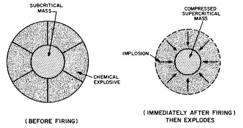
From the 1977 edition of Glasstone and Dolan’s The Effects of Nuclear Weapons. “Then explodes” puts it a little mildly, I think.
Not extremely informative — a ball-within-a-ball — and a heck of a lot less information than you can find from other sources. The reasons for this are ostensibly based in security — terrorists, enemy powers, etc. — though I tend to suspect they are based in the fear of scandal more than anything else. Congressional oversight gets itchy when they see something that looks like a “bomb-making guide,” even when it is well-within the limits of security. 1 (The basic implosion idea was declassified in 1951 as part of the Rosenberg trial, though there were knowledgable people arguing for it as early as 1945.)
I find the level of abstraction allowed in such drawings to be a little ridiculous, especially when far more detailed technical information is actually declassified. For reasons that I suspect are deeper than mere policy considerations alone, you can write a lot of things down that you can’t draw, if you’re someone with an actual security clearance. This isn’t totally nonsensical: drawings can make immediately clear lots of things that can otherwise hide in technical descriptions, which is one of the reasons that putative drawings of nuclear weapons are one of the topics that originally drew me to the topic of nuclear secrecy.
We aren’t really talking about blueprints here — these things aren’t usually to scale, they aren’t designed for engineers to use. Even if we were talking about blueprints, there are still quite a few steps in between a drawing of a thing and the thing itself. Drawings of this sort could certainly help an incipient nuclear program, but only in the sense that they can guide research questions or general directions. A drawing of an atomic bomb is not an atomic bomb.
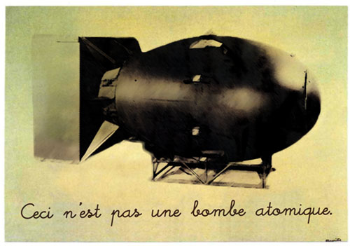
But even though the US is fairly tetchy about its bowdlerized bomb drawings, it does better than most other nuclear states. The United States actually publishes things about their nuclear programs. Though the US has a well-deserved reputation for secrecy, they also have put out tons and tons of technical and non-technical information about how their bombs work(ed), how bombs in general work, technical details about the weapons themselves, and so on. Why? It’s a legacy, perhaps, of the Smyth Report, Atoms for Peace, and other gestures towards the positive role that nuclear information can play in the public sphere.
Ah, but there is one exception: post-Soviet Russia. The people working at Rosatom, the Russian state nuclear agency/corporation, have been publishing impressive amounts of raw historical documents information about the Soviet bomb project, as part of their on-going series Atomnyi proekt SSSR/Атомный проект СССР/USSR atomic project. The series started in 1998, and the early volumes have gotten a lot of good scholarly attention by folks like Alexei Kojevnikov and Michael Gordin, but only very recently did I find that they’ve been still publishing them, and from what I can tell, the newer volumes have not been used too much. The most recent volume that I’ve heard of — volume 3 — was published in 2009. Getting ahold of them is another matter altogether; in the United States, anyway, they’re devilishly hard to find to purchase, and even on Russian websites they are pretty rare. The Library of Congress has the first two volumes in their entirety, and I think I’ve found a source for purchasing the third (supposedly it is on its way), but not without some effort.
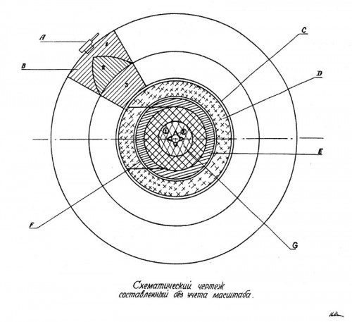
Here, for example, is the sort of drawing that the Russians declassified and published in one of the 2007 volumes:
Nuke aficionados will recognize immediately that this is a pretty good drawing of an implosion bomb, especially when compared to the ball-within-a-ball. The labels are pretty straightforward: A– detonator; B– explosive lens (1–Comp. B outer lens, 2–Baratol cone, 3–Comp. B inner lens); C–cork lining; D–aluminum pusher; E–uranium tamper; F–boron plastic shell; G–the Po-Be initiator. The only weird part is that they didn’t label the actual plutonium core itself (the cross-hatched sphere that surrounded the G sphere), but I guess it went without saying. Note also that they’ve indicated how the core can be added in after-the-fact with the removable “trap door” pusher. That’s one of those nice little touches that says, “I am not merely trying to explain an abstract concept, I’m trying to tell you how we might build one of these things.”
But more awesome than the drawing itself — which you can, incidentally, get on a T-shirt, if you’re interested and go for that sort of thing — is its source. It’s from the Soviet archives, part of a report dated January 28, 1946, titled “Notes on the design of the atomic bomb: Description of the construction of the ‘explosion inside‘ type bomb.” 2 Get it, “explosion inside”? They hadn’t even formalized their terminology for “implosion” yet and were using a scare-quoted, made-up word in the meantime. As the report makes clear, this is a Soviet description of the American atomic bomb detonated at “Trinity,” based on intelligence received from Soviet spies at Los Alamos. (Other reports refer to Klaus Fuchs directly by name, though I’m not sure if the people drawing up this particular report knew he was the source.)
There is no way in heck that the American government would ever allow the release of so “detailed” a drawing from any source that had access to classified information. Granted, it’s a long way from being a “blueprint” — something the drawing itself acknowledges; the text at the bottom reads “schematic drawing, not to scale” — but it’s still the sort of thing that no weapons lab would want a Congressperson to see them handing out, much less publishing widely. But apparently Rosatom is not as burdened by this — when it comes to publishing pictures of American bombs, anyway! 3
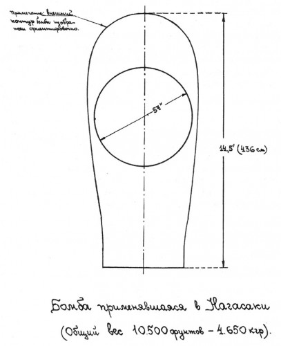
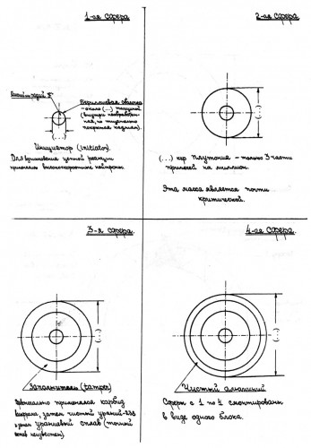
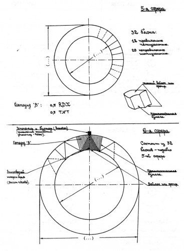
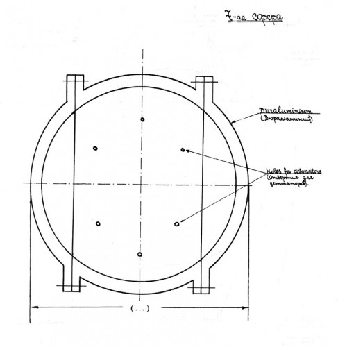
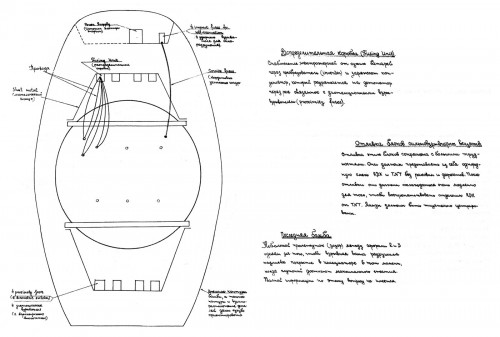
Here’s another fan-favorite — a series of drawings breaking the final assembled “Fat Man” bomb into its constituent parts, showing how they call go together, IKEA-style (click any of them to zoom):
The outer casing and the placement of the bomb within it. The caption at bottom says, “Bomb used on Nagasaki (Total weight 10,500 pounds – 4,650 kilograms).” I’m having trouble making out the “note” at the top left but it is seems to be saying something is tentative about the drawing.
The first four “spheres”: 1–initiator, 2–plutonium, 3–tamper, 4–aluminum pusher. Note that the publishers have omitted the exact measurements and replaced them with ellipses. It seems to indicate that the plutonium core is in “3 parts,” which jibes with an earlier post of mine (and indicates that the intelligence source really knew what he was talking about, not that we didn’t already know that). Actually, as is pointed out in the comments, if I had continued translating, I’d see that it says the plutonium must have impurities of only 3 parts per million. Still, a nice little detail.
Spheres 5 and 6: a layer of 32 blocks of chemical explosives, and then a layer of 32 blocks of explosive lenses. The detonator is labeled as a “booster” in English, oddly enough.
Sphere 7: the duraluminum casing, with “holes for detonators.” Comrade Beria likes his details! Compared with the Trinity Gadget.
Lastly, the overall arrangement of the bombs within the casing itself, with its electrical and detonating systems indicated. (You’ll perhaps recognize the first and last images here from another post I did, awhile back, as they are reprinted in a tiny form in another source.)
It’s a veritable nuclear Matryoshka doll, is it not? I wish I could make this stuff up, but I can’t. My favorite part about this document, though, is the fact that so much of the captions are in English — again, as if any indication were needed about where this information was coming from. The document itself was written by Igor Kurchatov for Lavrenty Beria, dated June 4, 1946.
There isn’t anything remotely like a security threat here — you can get better drawings on Wikipedia these days, without the numbers redacted — but to have stuff like this published by an actual nuclear power, based on data they derived in the course of making their own atomic bomb, data taken from a source working in a weapons lab… well, let’s just say, I don’t think it’s going to happen over here anytime soon.
Still, the drawings do have a talismanic power, and the Mandala-like quality of the implosion design doesn’t hurt that. It’s the bomb, right? And yet, it’s really not. It’s a drawing. A technically crude one, albeit more detailed than the other “official” releases. It’s no surprise, I suppose, how easily we get sucked in by the superficially technical — whether it carries any real power or not.
- See, for example, page 70 of chapter 2 of the Cox Report, which criticized Los Alamos for releasing exactly this kind of heavily-sanitized information.[↩]
- Заметки о конструкции атомной бомбы. Описание конструкции бомбы типа “взрыва вовнутрь.”[↩]
- This reminds me of a joke from the Brezhnev-era USSR that a Russian teacher of mine told me: During a visit to the United States, Premier Brezhnev and President Carter happen to see a protest. “No Carter, No Reagan!” the protesters shouted. “You see,” said Carter, “in our country we have freedom of expression, something you don’t have over in your country.” “Ah, Comrade,” says Brezhnev, “you are wrong! Come over and see!” So they go to Red Square, and indeed, there is a mob of protesters forming, shouting, “Nyet Carter, nyet Reagan!”[↩]


I suspect the US had the codename ‘doughnuts’ for the drawings! They were released to tease!!
“3 parts” in the description of the plutonium core refers to the impurities in plutonium – 3 parts per million.
Ah, you are correct! This is what I get for not bothering to look at the very next line, where it is quite clear… Sloppy, sloppy!
Does the LOC actually have books 6-7 of Atomnyi proekt SSSR vol. II? Last I was there in 2010, they only had a a couple of the earlier books, much to my disappointment. If they do, I’ll need to try and get my hands on them to look at some documents I’ve seen cited.
These things are infuriatingly hard to get even in Russia-they were very hard to buy even in the handful of Moscow bookstores that cater to professional scholars, and I wasn’t able to get some volumes out of the Lenin Library in 2009-10.
The LOC does have all of volumes I and II (including books II.6-II.7) but none of III. I currently have all of them checked out to a study shelf, but if you are looking for specific documents, let me know via e-mail and I might be able to photograph them for you the next time I’m over there (which is pretty often).
> I’m having trouble making out the “note” at the top left but it is seems to be saying something is tentative about the drawing.
It says,
Note: The outer contour of the bomb is shown for orientation [purposes].
[…] I’ve recently added two more shirts: one featuring that Soviet drawing of the American implosion bomb, derived from espionage, and the other of the striking diagram illustrating the concept of […]
[…] on the mark when we look at the history of the Soviet program. Even though the Soviets did have very detailed design information on the atomic bomb, it still took a tremendous effort to turn that into an actual bomb, and it has become much more […]
[…] the contents of the patent appear to have been declassified, and published, in Russia. I’ve talked a bit in the past about how the Russians have declassified a bunch of information about the American bomb project […]
It looks like there is one layer too many in the Soviet drawing. Item D makes sense as the aluminum pusher, with the cork between it and the lenses. Item E would be the uranium, wrapped with the boron shell. But the larger of the two cross-hatched areas is anamalous.
Item G appears (to me) to be the Pu core, with the tiny urchin in the middle (along with those two odd, slightly offset ‘eyes’ above it). As the sizes of the spheres in the drawing appear to be roughly proportionally correct, I can’t imagine the urchin being so large.
But then what would be the layer covering the plutonium, the one you note as being unmarked?
They have drawn the urchin not to scale at all — it is the really large thing in the center (G). I know, it’s weird. I spent a lot of time puzzling over this, but that’s what the original caption says. My guess is that they enlarged it to make it clear how it was arranged, with the inner “ball” of polonium and the outer, spiky layer of beryllium. (It would not be possible to convey that detail in a single diagram at the correct scale.) As a result, the urchin is waaay too large, and as a result of that the plutonium core is waaay too large. So there is a weird scale thing here, where the lenses are roughly the right proportion but nothing else is.