A year ago this week, I launched the NUKEMAP. It’s perhaps fitting that this week, NUKEMAP also (coincidentally) hit 10 million “detonations.” That corresponds with just over 2.25 million pageviews (1.96 million unique). Which is pretty crazy. I attribute a lot of the success I’ve had with this blog to the NUKEMAP, as a driver of traffic. A few percent of the visitors look at the blog; a few percent of them become regular readers. A few percent of two million is a lot of people.
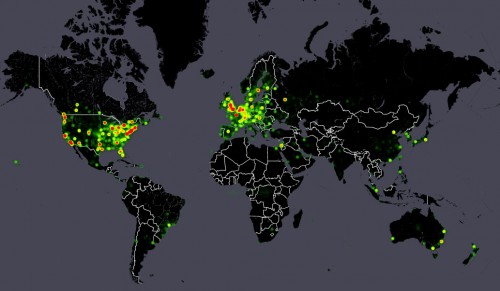
The mapping of where people bombed doesn’t look significantly different than did the first million, so I won’t post another one of those images. But here’s some fun-with-data for you: below is a heatmap of all of the 10 million detonations. The “hotter” it is (e.g. red or orange), the more times a given place or region was nuked. I shaved off a few decimal places from the latitude and longitude coordinates so that repeated nukes in the same basic area were lumped together (and so you don’t have to worry if you nuked your neighbor’s house a million times), but it is still pretty granular.
If you click on the image, you’ll go to an interactive version.1
For people who are into metrics, here are the daily, weekly, and monthly pageview graphs of the NUKEMAP from Google Analytics. After an initial big burst, it died down a bit (to 2,000 hits or so a day, mind you), punctuated by occasional new big bursts as it occasionally landed on the Reddit front page every once in awhile.
Hey, even Jon Stewart was into it:
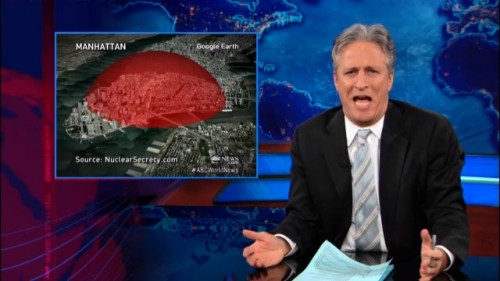
John asks: “When did lower Manhattan become the standard unit of destruction measurement?” Answer: Certainly by the late 1940s, probably even earlier.
OK, so Jon Stewart posted something that was originally from ABC News, so technically ABC News was into it, but it’s still Jon Stewart! I’ll take what I can get in that department!
Awhile back I did a write-up of NUKEMAP usage patterns for WMD Junction, an online journal: So Long, Mom, I’m Off to Drop the Bomb: A Case Study in Public Usage of an Educational Tool. Check it out if you are curious about who-bombed-who.
People have also done some pretty cool things with it. The infographic shown by Jon Stewart derives from a setting that was sent around on Reddit and elsewhere showing the effects of a 6 kiloton bomb on lower Manhattan, with 6 kilotons being one of the yield estimates of the 2009 North Korean test. 6 kilotons doesn’t sound like a lot by modern standards, unless you happen to be right underneath it, and then it’s probably worth taking seriously.
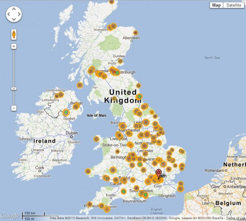
An engineer in the U.K. (who has asked to be credited only as “RLBH”) recently made and sent me an incredibly elaborate map modeling “Probable Nuclear Targets in the United Kingdom” as imagined by the Joint Intelligence Committee of the British Ministry of Defence in 1967:2
That’s pretty neat, and is actually very much related to the original project of which NUKEMAP was originally a spin-off (dubbed as TARGETMAP, which I’ve put indefinitely on hold for the moment for lack of time).
There’s only one lesson that I’ve been a little disturbed by. An awful lot of people are amazed at how small the Hiroshima and Nagasaki bombs were compared to thermonuclear weapons. That’s true — but it’s because the megaton-range weapons were insane, not because the Hiroshima and Nagasaki bombs were small. By human standards, 10-20 kilotons should still be horrifying. From a view of 100,000 feet, though, it’s a lot less impressive than the Tsar Bomba, even though the latter was a lot less of a realistic threat than weapons of “smaller” yields, and is certainly a lot less of a threat today. When you put “small” nukes next to monstrous nukes, it is easy to lose perspective. That’s not my goal — my goal is to help people get a sense of scale, something that I think is even more important in a post-Cold War age.
So I’m excited to announce that I’m deep in the coding of a successor to NUKEMAP. It isn’t quite ready for prime time, yet, but it’s well past the proof-of-concept stage. It works. I’m trying to incorporate the lessons I learned with the use and reception of the first NUKEMAP into the new one, and trying to provide a very different sort of user experience. The details are still hush-hush. I’ve told a handful of people about it in person, to gauge reactions, and have a few beta testers lined up, but I’m confident enough to say that this is something entirely new. The new NUKEMAP will do things that no other online nuclear effects simulator does. So keep an eye out for it. There is no estimated-time-of-arrival — it’ll be up when it’s good and ready — but it will probably be up by the end of spring 2013.
- Note: the underlying dataset for the 10 Million browser is static. So it would not be worth your time trying to influence how it looks at this point by bombing all over the place. [↩]
- RLBH sent me some details on how he made his map:
I’m sure you’re familiar with Professor Peter Hennessy’s book The Secret State: Preparing for the Worst, 1945-2010 (London: Penguin, 2003), which contains (amongst other things) a list of ‘Probable Nuclear Targets in the United Kingdom’ drawn up by the Joint Intelligence Committee of the British Ministry of Defence in 1967. This list suggests the use of some 377 nuclear devices against 100 targets in the United Kingdom, none of less than 500 kilotons yield and with a total yield between 272.5 and 362.5 megatons.
I know that a Swedish gent has used your NUKEMAP tool to generate his own targeting plan against Sweden, but I’ve not heard of it being used to illustrate a ‘real’ war plan before. For my own elucidation, I’ve modelled the JIC’s targeting plan for the UK in NUKEMAP, with the following caveats applying to my method.
– Where multiple devices are programmed for a single point target, I’ve only modelled the largest. Some such targets were overkilled to a remarkable extent, even allowing for delivery system unreliability – most command & control centres, for instance, were allocated two missiles warheads of 3 megatons each, and two 1 megaton gravity bombs.
– For the industrial area targets, I’ve selected DGZs on the basis of my own best judgment, generally seeking to maximise the industry receiving 20 psi of overpressure. Unsurprisingly, this results in significant overkill against the housing and population of the targeted cities. This also means that some surprisingly large cities are totally untouched by the initial strike, which would certainly be targeted in a pure countervalue ‘dehousing’ strike. I’ve similarly eyeballed the attack on London, assuming here that the eight one-megaton warheads would be dual-targeted on four DGZs.
– I’ve not made any allowance for devices initiating over other than their programmed DGZ. This means, in effect, that two or three devices are ‘wasted’ against some targets, which could in fact be more profitably used elsewhere. This is especially the case, of course, for the bomber-carried devices, as these can more readily be retargeted.
– Where the yield of devices is specified as a range, I’ve used the simple arithmetic mean of the maximum and minimum. This means there are a few unusual sized weapons used.
– I’ve treated all devices as airbursts, because of the limitations of NUKEMAP. This isn’t meant as a criticism, it’s far and away the best tool of its’ kind that I’ve seen, and there’s obviously a tradeoff between usability and flexibility. In any case, some 140 devices directed against 70 targets (bunkers, dockyards and airfields) ought to be ground bursts.
– I’ve also interpreted the central government target at Cheltenham to mean the BURLINGTON bunker at Corsham, rather than GCHQ as Hennesy does. Both would be viable targets, but GCHQ is out of keeping with the rest of the list, whereas BURLINGTON was thought highly likely to be compromised and it’s unlikely that RSGs would be hit and the Government bunker ignored. [↩]



I grew up about 15 miles away from Cheltenham, and we always assumed that it would be one of the first places to get bombed.
As we were over a few hills our village would probably survive the initial detonation, only to be covered with fallout. My mum used to keep enough paracetamol in the bathroom cabinet to kill the whole family, which is horribly messed up when you think about it.
I assume there’s still a warhead in a silo somewhere with the co-ordinates of my home town programmed into it.
Especially given the way paracetamol overdose kills you.
I live about one mile away from GCHQ. When I had a look at this map it was pretty horrifying to see that even a 7 Kilo-tonne bomb would kill me instantly.
I think you’re right about the perceived similarity between kiloton-class and megaton-class devices: the difference between the two is similar to that between a WW2-era ‘blockbuster’ and a kiloton-class device. Our minds aren’t wired to cope with that difference in scale, and discussion of the 1950s-1980s tended to centre around the bigger weapons. That we forget how much larger those are than their predecessors isn’t surprising, really.
NUKEMAP II: Electric Boogaloo sounds interesting. Unsurprisingly given the use I’ve got out of the original version (I reckon at least 500 initiations all told) I have a few thoughts where you might go. Death tolls and fallout mapping are the obvious ones, but I look forward to finding out.
I wonder if some of what is driving the “Little Boy/Fat Man weren’t really that big” perception is the change in US housing patterns, specifically the rise of suburbs and exurbs, together with a mis-perception of the meaning of the effect rings.
When NUKEMAP came out I “dropped” a Hiroshima size bomb on the nearest significant target – the terminals at the DFW airport. You know what? The damage rings didn’t even make it out side of the airport perimeter.
So I switched to targeting downtown Dallas. My eighty year old first generation suburb was comfortably outside the thermal radiation ring. Actually, my house would be about the same distance from ground zero as Oppenheimer and others were to the Trinity gadget and while that blast made an overwhelming impression on them, it didn’t seem to put them in any great danger.
People living in the 1960’s suburb of Richardson would be farther away (> ~10 miles) than the base camp observers at Trinity. And people at the current edge of suburbia, like those in McKinney, would be 30 miles away.
Before dismissing my example because “things are bigger in Texas”, note that it’s about 25 miles from the Empire State Building to Levittown.
Now I am aware that the damage doesn’t stop at the edge of the largest ring (and if I were a betting man, I’d say NUKEMAP II will seek to remedy this shortcoming) but I’m suspect that is how many people read the maps. And given that many people in the US live a fair piece away from obvious “targets”, NUKEMAP is easily read as suggesting that 20kt isn’t all that big.
I think you might be right, but I wouldn’t say it was purely a result of American development patterns. Even the UK, which has pretty compact development, displays the same phenomenon. I live in a Victorian era low-rise block close to the centre of a major city, and 20 kilotons over my head would leave the suburbs, and half of the city centre proper, outside the rings.
The HYDESim tool shows the 0.25 psi overpressure contour, which covers the area in which glass is broken. This is quite useful, as the average person has no problem appreciating that kind of damage as being quite severe. Conveniently, it’s actually about the level a Cat. 3 hurricane or F2 tornado exerts – I’d imagine these are more familiar measures in Texas than in Britain!
Actually, I did want to say: if you have math skills and would like to be of assistance, let me know. There are a few instances in which I have models for things like fallout dispersal where I could really use some assistance in simplifying the equations and turning them into something I could use in my scripting. If you are interested, get in touch, and I can outline the issues.
I’m interested and I probably have the relevant math chops. You can reach me at the email in this comment.
I’d love to help, if you still need some manpower 😀
I would also be happy to help. And I have some understanding of physics. ( Email is in the comment.)
I can take a gander.
Don’t see any dots in India or Pakistan.
MK
They are there, but they are not nearly as numerous as the dots in the US, Europe, and East Asia, so they get dimmed out quite a bit by the Google Maps heatmap API. (And get dimmer as you zoom in further, for whatever reason.) New Delhi, Mumbai, Bangalore, Lahore, Karachi, and Islamabad all have a fair number of hits. The preset location for New Delhi has at least 11,826 “blasts,” Islamabad some 11,721. There are a lot more that are not in the presets but it is hard to get an aggregate of them.
Also, when I did my analysis on the first million, there were about 13,800 in India and 8,500 in Pakistan. I’ll see if I can get new stats from the data; it might be a bit too much for MS Access.
There are a few, Michael, but they’re faint. They’re more visible if you click on the map and enlarge it.
Are you familiar with this, Alex?:
http://www.dtic.mil/dtic/tr/fulltext/u2/a088512.pdf
Yes… there are lots of models out there. From what I can tell, a lot of them are not only overly complicated (like that one, which is really much more first-principles than I want for something like NUKEMAP — particle size estimations and all that) but don’t perform very well. I’ve gone over pretty much every fallout model I’ve found on the web looking for compromises; there is one that I prefer the most (you can pretty much just give it yield, wind speed, and altitude of burst, and it does the rest), but it is still something that will require some work to adapt. And lord knows I have no desire to try and convert FORTRAN to Javascript… 😉
This is great Alex. I’m looking forward to NUKEMAP II.
There’s a part in Dark Sun where Rhodes quotes some guy who had seen some fission bombs (and therefore wasn’t easily impressed). When he saw Mike go off he was just floored. The scale was just off the charts compared to the fission bombs. I bet Bravo was an even bigger surprise.
[…] BLTN: NUKEMAP! […]
Time to include Chelyabinsk and Tunguska
I’m a little wary about blending the lines between nukes and other phenomena, for reasons I’ll be posting about soon…
[…] you translate it into terms that are meaningful to them. That was the whole point of the NUKEMAP: to take these numbers and try to come up with geographical representations that make intuitive […]
[…] year later that program hit “10 million detonations” and Wellerstein was able to publish on the subject. What particularly struck him about the […]