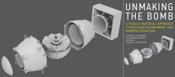
I’ve had some very favorable interactions with the people at the Program on Science and Global Security at Princeton University over the years, so I’m happy to announce that four of the faculty have collaborated on a book about the control of fissile material stockpiles. Unmaking the Bomb: A Fissile Material Approach to Nuclear Disarmament and Non-Proliferation, by Harold Feiveson, Alex Glaser, Zia Mian, and Frank von Hippel, was recently published by MIT Press. Glaser, who does some pretty far-out work at the Nuclear Futures Lab (among other things, he has been working on really unusual ways to verify weapons disarmament without giving away information about the bombs themselves — a really tricky intersection of policy, technical work, and secrecy), asked me if I would help them design the cover, knowing that I like to both dabble in graphic arts as well as bomb-related things. Here is what we came up with, in both its rendered and final form:
The “exploded” bomb here is obvious a riff on the Fat Man bomb, simplified for aesthetic/functional purposes, and was created by me using the 3-D design program Blender. (The rest of the cover, i.e. the typography, was designed by the art people at MIT Press.) The idea behind the image was to highlight the fact that the fissile material, the nuclear core of the bomb, made up a very small piece of the overall contraption, but that its importance was absolutely paramount. This is why the non-nuclear parts of the bomb are rendered as a sort of grayish/white “putty,” and the core itself as a metallic black, levitating above.
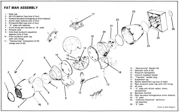
The original idea, proposed by Glaser, was to do sort of a modern version of a drawing that appears in Chuck Hansen’s U.S. Nuclear Weapons: The Secret History (Aerofax: 1988). Hansen’s image is a thing of beauty and wonder:
I first saw this diagram when I was an undergraduate at UC Berkeley, working on a project relating to nuclear weapons — one of my first exposures to this kind of stuff. I had checked out pretty much every book on the subject that was in the Berkeley library system, which meant I found lots of unexpected, un-searched-for things serendipitously amongst the stacks. (This is something that I think has been lost, or at least not replicated, with increased reliance on digital sources.) I saw this diagram and thought, “Wow! That’s a lot of information about an atomic bomb! I wonder how he got all of that, and how much of it is real and how much is made up?” I don’t want to say this diagram is what made me want to study nuclear secrecy — origins and interests are always more complicated than that, and a close friend of mine recently reminded me that even in elementary school I used to talk about how nuclear bombs were made, armed with the beautiful-but-highly-inaccurate drawings from Macaulay’s The Way Things Work), but it did play a role.
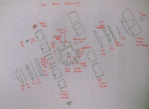
Eventually I did track down a lot of information about this particular diagram. I found Hansen’s own original sketch of it (in his papers at the National Security Archive) that he gave to the artist/draftsman who drew the piece, Mike Wagnon:
I also tracked down Wagnon, some years back now. He told me how he drew it. The original drawing was made many times larger than it was going to be in the book — it was four feet long! After being finished, it was reduced down to the size on the page in the book, so that it just looked like it was packed with fine detail. He also confirmed for me what I had come to suspect, that the diagrams in Hansen’s book, as Wagnon put it to me in 2004, “advertise an accuracy they do not have.” A lot of it was just deduced and guessed, but when you draw it like an engineering diagram, people assuming you know what you’re doing.1
Looking at it now, I can see also sorts of really serious errors that show the limits of Hansen’s knowledge about Fat Man in 1988. An obvious one is that it is missing the aluminum pusher which sits in between the tamper and the high explosives. There are other issues relating to the most sensitive parts of the core, things that John Coster-Mullen has spent several decades now working out the details of. Hansen, in his later Swords of Armageddon, corrected many of these errors, but he never made a diagram that good again. As an aside, Wagnon’s version of Little Boy — which we also now know, because of Coster-Mullen, has many things wrong — was the source of the “blueprint” for the bomb in the 1989 film Fat Man and Little Boy:
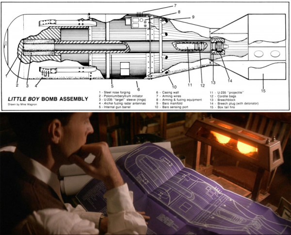
At top, Wagnon’s diagram of Little Boy from Hansen’s 1988 U.S. Nuclear Weapons. At bottom, a screenshot from the 1989 film Fat Man and Little Boy shows Oppenheimer pondering essentially the same image.
Anyway, I am getting off the thread a bit. Unmaking the Bomb, aside from having an awesome cover, is about fissile materials: enriched uranium and separated plutonium, both of which can be readily used in the production of nuclear weapons. The authors outline a series of steps that could be taken to reduce the amount of fissile materials in the world, which they see as a bad thing both for non-proliferation (since a country with stockpiles of fissile materials can basically become a nuclear power in a matter of weeks), disarmament (since having lots of fissile materials means nuclear states could scale up their nuclear programs very quickly if they chose to), and anti-terrorism (the more fissile materials abound, the more opportunities for theft or diversion by terrorist groups).
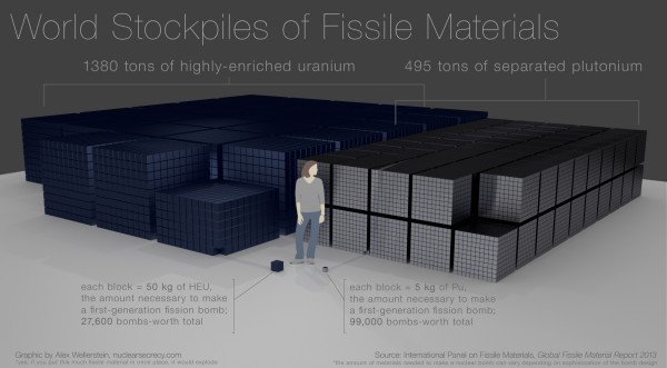
The Princeton crew is also quite active in administering the International Panel on Fissile Materials, which produces regular reports on the quantities of fissile materials in the world. Numbers are, as always, hard for me to visualize, so I have been experimenting with ways of visualizing them effectively. This is a visualization I cooked up this week, and I think it is mostly effective at conveying the basic issues regarding fissile materials, which is that the stockpiles of them are extremely large with respect to the amounts necessary to make weapons:
Click the image to enlarge it. The small blue-ish blocks represent the approximate volume of 50 kg of highly-enriched uranium (which is on order for what you’d need for a simple gun-type bomb, like Little Boy), and the small silver-ish blocks are the same for 5 kg of separated plutonium (on order for use in a first-generation implosion weapon). One can play with the numbers there a bit but the rough quantities work out the same. Each of the “big” stacks contain 1,000 smaller blocks. All references to “tons” are metric tons (1,000 kg). The “person” shown is “Susan” from Google SketchUp. The overall scene, however, is rendered in Blender, using volumes computed by WolframAlpha.
I made this visualization after a few in which I rendered the stockpiles as single cubes. The cubes were quite large but didn’t quite convey the sense of scale — it was too hard for my brain, anyway, to make sense of how little material you needed for a bomb and put that into conversation with the size of the cube. Rendering it in terms of bomb-sized materials does the trick a bit better, I think, and helps emphasize the overall political argument that the Unmaking the Bomb authors are trying to get across: you can make a lot of bombs with the materials that the world possesses. If you want the run-down on which countries have these materials (spoiler: it’s not just the ones with nuclear weapons), check out the IPFM’s most recent report, with graphs on pages 11 and 18.
To return to the original thread: the bomb model I used for the cover of Unmaking the Bomb is one I’ve been playing with for a while now. As one might imagine, when I was learning to use Blender, the first thing I thought to try and model was Fat Man and Little Boy, because they are subjects dear to my heart and they present interesting geometric challenges. They are not so free-form and difficult as rendering something organic (like a human being, which is hard), but they are also not simply combinations of Archimedean solids. One of my goals for this academic year is to develop a scaled, 3D-printed model of the Fat Man bomb, with all of the little internal pieces you’d expect, based on the work of John Coster-Mullen. I’ve never done 3D-printing before, but some of my new colleagues in the Visual Arts and Technology program here at the Stevens Institute of Technology are experienced in the genre, and have agreed to help me learn it. (To learn a new technology, one always needs a project, I find. And I find my projects always involve nuclear weapons.)
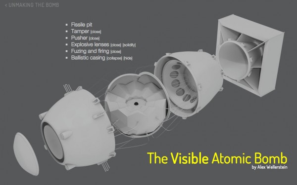
For a little preview of what the 3D model might end up looking like, I expanded upon the model I developed for the Unmaking the Bomb cover when I helped put together the Unmaking the Bomb website. Specifically, I put together a little Javascript application that I am calling The Visual Atomic Bomb, which lives on the Unmaking the Bomb website:
I can’t guarantee it will work with old browsers (it requires a lot of Javascript and transparent PNGs), but please, give it a shot! By hovering your mouse over the various layer names, it will highlight them, and you can click the various buttons (“hide,” “show,” “open,” “close,” “collapse,” “expand,” and so on) to toggle how the various pieces are displayed. It is not truly 3D, as you will quickly see — it uses pre-rendered layers, because 3D is still a tricky thing to pull off in web browsers — but it is maybe the next best thing. It has more detail than the one on the cover of the book, but you can filter a lot of it on and off. Again, the point is to emphasize the centrality of the fissile material, but to also show all of the apparatus that is needed to make the thing actually explode.
I like to think that Chuck Hansen, were he alive today, would appreciate my attempt to take his original diagrammatic representation into a new era. And I like to think that this kind of visualization can help people, especially non-scientists (among which I count myself), wrap their heads around the tricky technical aspects of a controversial and problematic technology.
- I wrote a very, very, very long paper* in graduate school about the relationship between visual tropes and claims to power through secrecy with relation to the drawing of nuclear weapons. I have never quite edited it into a publishable shape and I fear that it would be very hard to do anything with given the fact that you really need to reproduce the diagrams to see the argument, and navigating through the copyright permissions would probably take a year in and of itself (academic presses are really averse to the idea of relying on “fair use“), and funds that nobody has offered up! But maybe someday I will find some way to use it other than as a source for anecdotes for the blog. *OK, I’ll own up to it: it was 93 pages long (but only 62 pages of text!) when I turned it in to the professor. I was told I should either turn it into a long article or a short book. [↩]

Great post Alex. Very interesting. If you ever get around to printing the bombs please sell them on your site. “Shut up and take my money!”
I have already ordered the book. My only problem is that I see some serious criticallity safety issues on the “world stockpiles” figure 🙂
Second, I would buy a 3d printed Fat Man.
Perhaps the best way to show how many bombs you could produce from a given amount of fissile materials would be to show a stack of bombs?
I just reviewed that book for an upcoming Nature issue. It’s thorough, written clearly, and completely convincing. I couldn’t figure out whether “tons” in the book was also metric tons so when the copy editor asked, I punted. Do you think it was?
And I’m surprised and delighted to know that the beautiful cover imagery is by the very Alex Wellerstein. Your new visualization of the amount of fissile material is frightening — I wish it had been in the book.
Thanks, Ann. In the Fissile Materials report, they say at one point that tons refers to metric tons, so I assume that’s the same ultimate source of it. (It would be weird to use imperial tons and then spend so much time talking about kilograms, too.)
Visualization was stunning and you really get a sense of how many different components were needed just to compress that simple 5kg sphere. And all had to go off in just the right right way at just the right time or nothing happened. Incredible.
Would you ever consider doing one for the Castle Bravo shot?
Well I’m glad to hear that i was not the only child in the world who started annoying his classmates in elementary school by always talking about nuclear weapons! 😉 Do you think that there’s a chance the veil of secrecy on the technical side of nuke-history will be ever lift? Something like the history of primaries design or the oral histories recorded at LANL?
Looking forward to read the book.
Great post, Alex. One typo: in the graphic on the stockpiles of fissile materials, you say “once place” instead of “one place”. Since this graphic is sure to be stolen, you may as well correct it. (Or leave it, and see the error proliferate. 🙂
[…] As I wrote about not long ago, I designed the cover and their website. [↩] […]
Alex,
Thanks for the credits. There were things we knew that we didn’t put in because we didn’t think it prudent at the time.
It was great working with Chuck, who really was genius-level talent. Of course, the drawings are still under copyright, for those interested.
Your drawings were great. I deeply miss Chuck and his wry sense of humor.