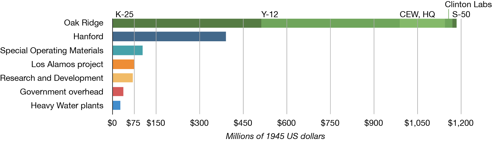
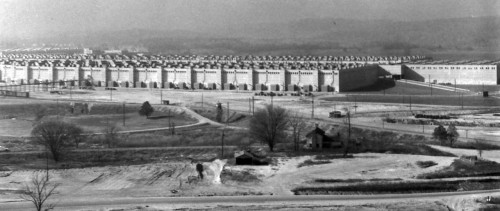
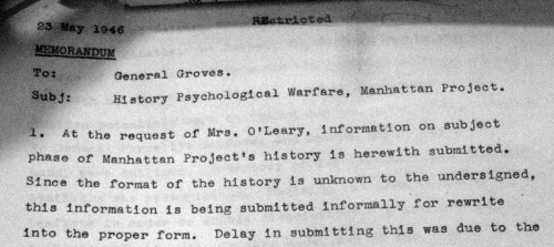
The K-25 plant at Oak Ridge was the single most expensive part of the Manhattan Project. It was cost about a fourth more than the entire Hanford site. Perhaps unsurprisingly, the building that housed it was pretty big — supposedly the largest single factory in the world under one roof, at the time that it was built.
I had thought about creating some kind of little graphic comparison to show you how big it was — you know, putting it next to The Pentagon and other large buildings — and then I realized that I wouldn’t really be flexing my geek cred, or taking advantage of a web medium, if I didn’t make a little custom mashup instead. So, I present for you a quick little app that I’m calling, How Big Was K-25?, where you can drag the footprint of K-25 onto anywhere in the world to make a size comparison:
(If you only see a blank spot above, or if you want to view it larger than it is displayed in the blog post, then click here to open the page in its own window. Note that there is a “rotate” button in the upper-left corner, if you want to re-arrange K-25.)
And yet… despite its cost, despite its size, when one thinks of images of the Manhattan Project, even images of Oak Ridge, views of the inside K-25 aren’t what comes to mind. We’ve all seen the images of the Y-12 “racetrack,” and many of us have seen images of the face of the B-Reactor, but what does a gaseous diffusion plant look like?
A reader asked this question in a comment on last week’s post, and it got me scratching my head, and asking around on Twitter. I got enough interesting results that I felt it was worth a post in its own right, as opposed to just a long comment. I can think of two major reasons why this sort of thing isn’t as common in the photos of the bomb project, which I’ll include at the end.
These photos were mostly taken by Ed Westcott, the official Oak Ridge photographer during the war (and after), and are hosted by the Oak Ridge Public Library. (Special thanks to the American Museum of Science and Energy for pointing this resource out to me!)
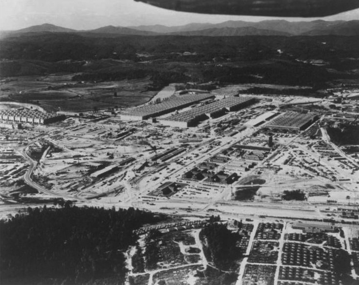
Overall aerial view of K-25 area
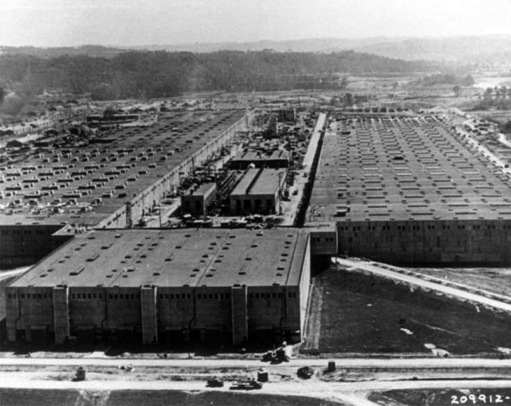
Close aerial view of K-25 Building
First we fly into the plant, in some typical pictures of its U-shaped bulk, but I like the juxtoposition as we get closer and closer. You can see some trucks at the very bottom center of the lower image, to get a sense of scale. It’s big.
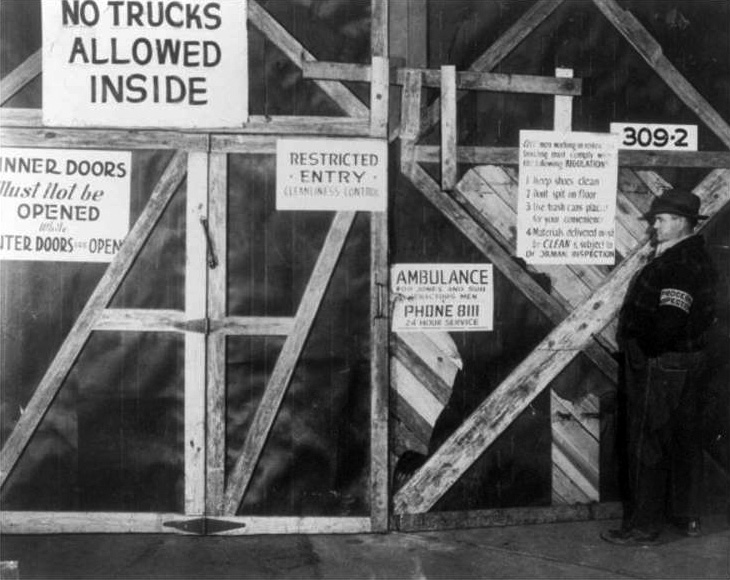
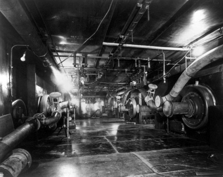
Cleanliness control gate
We think of the signs in such an installation to be all about security, but these ones are all about cleanliness. This appears to be some kind of basic air-lock. I find that somewhat charming, though one knows that grime is something you probably don’t want in a gaseous diffusion plant, where every atom counts!
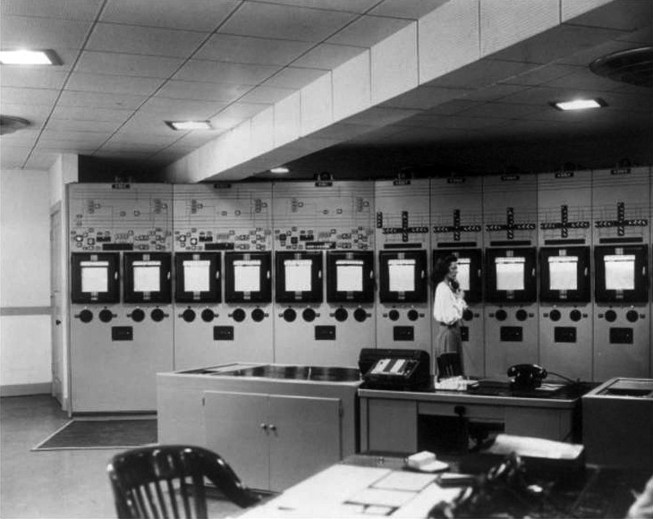
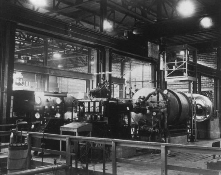
Control panels in master control room
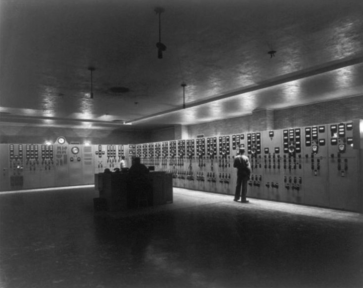
K-25 control room
Two control rooms. I find the one on the bottom to be a wonderfully haunting photograph. I love the difference between the size of the room and the tininess of that table. It must have been a tremendous pain to keep something as interconnected and complex as the K-25 plant humming around the clock.
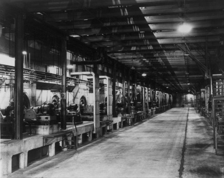
K-25 typical withdrawal alley
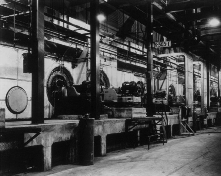
Front elevation of gaseous diffusion cells in K-303-1
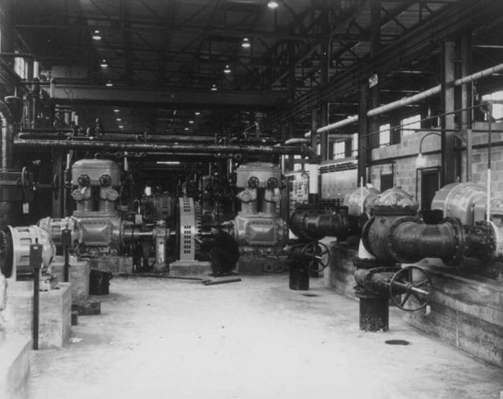
Air compressors and water pumps from K-1101 Building
Conditioning filter test
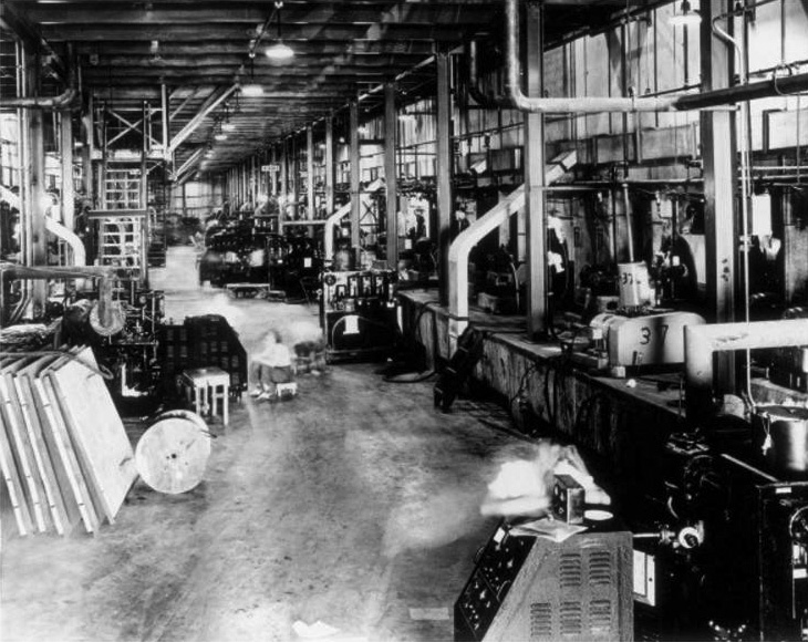
Stage floor in K-306-6 showing vacuum testing
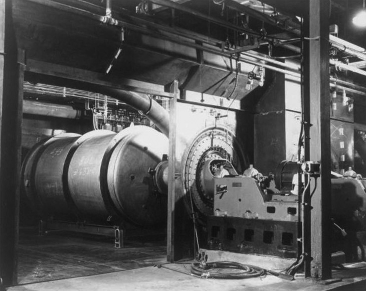
Interior of gaseous diffusion cell structure
These ones all seem to show the insides of various stages of the cascade. As you can see from this plot plan, K-25 consisted of lots of individual “cells” that were linked together. Its vastness and bulk is mostly iteration of stages, like most (all?) uranium enrichment facilities — each stage doing a tiny part of the overall work.
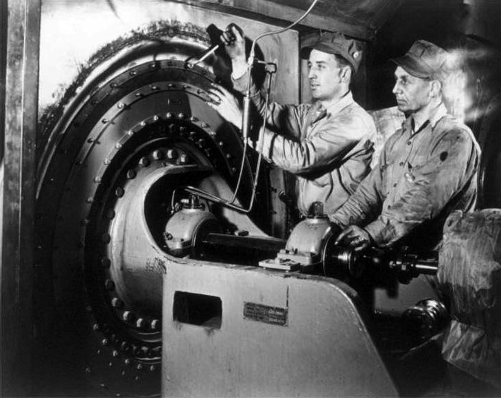
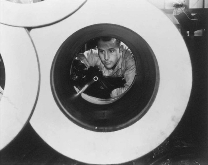
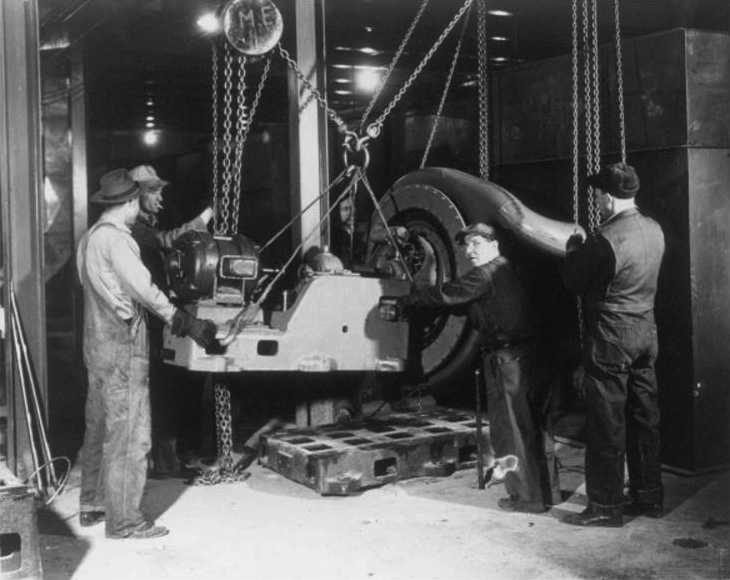
Two workers standing by a gaseous diffusion cell
A solvent degreaser worker showing pipe assembly in K-1400
Typical filter in gaseous diffusion cell
Typical setting of process pump
These ones I like because they help give you some sense of the size and nature of the equipment involved. Gaseous diffusion plants look like various pipes and pumps and big vessels. In a way, they are somewhat generic looking, which may be why they aren’t usually used to illustrate uranium enrichment, as I’ll speculate on a little bit below.
Lastly, a few color images, probably taken at a later date, from the Manhattan Project Heritage Preservation Association:
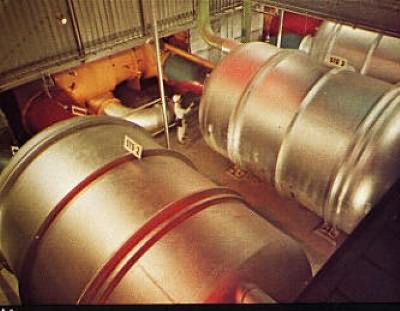
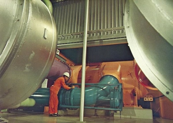
Both of these I like not only because of the color — how much of those paint jobs are post-1945, I don’t know — but also because the presence of people helps you get a sense of the scale of those vessels. They seem larger than the ones in the other photographs, so they may be later additions. Thanks to Jeffrey Lewis for pointing this out to me.
So why are these images dreadfully underrepresented in our collective imagination regarding the Manhattan Project? I offer three possible reasons.
One is the familiar problem of classification: gaseous diffusion was highly classified after the war. Unlike the electromagnetic enrichment method, or the basics of reactor operation, it wasn’t declassified in the early 1950s. There are still lots of things that are tied up tight as far as classification is concerned, despite the fact that gaseous diffusion is a pretty old technology, and arguably not the technology of choice for a modern proliferator (too expensive, too difficult).
Another is that gaseous diffusion arguably wasn’t as significant to the war effort as electromagnetic enrichment (though it wasn’t exactly insignificant, either); it came online a lot later, and really wasn’t perfected until after the war ended. Also, in comparison to the electromagnetic method, it also lacked as enthusiastic a booster as Ernest O. Lawrence, who was nothing if not entrepreneurial in promoting technologies that he was involved with.
And lastly, a potential other reason though is that as a concept it’s a bit harder to grasp, a bit hard to explain, and a bit harder to display visually, than other methods of enrichment. Electromagnetic enrichment is pretty easy to understand, and easy to diagram. And once you’ve seen how it works, suddenly images of Calutrons make a lot of sense — ah, there’s that C-shape. Rope them around a magnet and you’re done. It corresponds with nice intuitive notions of classical mechanics, and can be the source of all sorts of plain-language analogies (throwing heavier or lighter baseballs, for example).
Gaseous diffusion involves shooting gas through specialized barriers, relying on slightly different transit times, and visually, looks like just so many big tubs connected to one another. Internally it looks a lot like a lot of other anonymous industrial plants; its size, and its radioactivity, are perhaps the only things that make it obvious that it isn’t some kind of anonymous solvent factory. The kinds of diagrams explaining its operation that circulated in the early days were not exactly stimulating to thought, either.
All of this discussion of K-25, of course, is thoroughly in the past tense. Most of K-25 has been torn down; demolished. The DOE has been fairly unenthusiastic about preserving any of the K-25 buildings, despite their historical relevance. I think this is really, truly too bad. Whatever one’s feelings about the Manhattan Project, destroying historical sites doesn’t really help anybody. This is one of the reasons I’m a supported of the Atomic Heritage Foundation‘s efforts to have a number of the few remaining Manhattan Project sites declared part of a new Manhattan Project National Park. Aside from the possibility of using them as the focal point for interesting interpretations of our atomic history, it’s also necessary if we’re going to expect any remnants of these buildings to still be around in generations to come, as the Manhattan Project slides out of living memory. We can argue about the meaning of these sites for years and years — but only if we still have them to argue about.